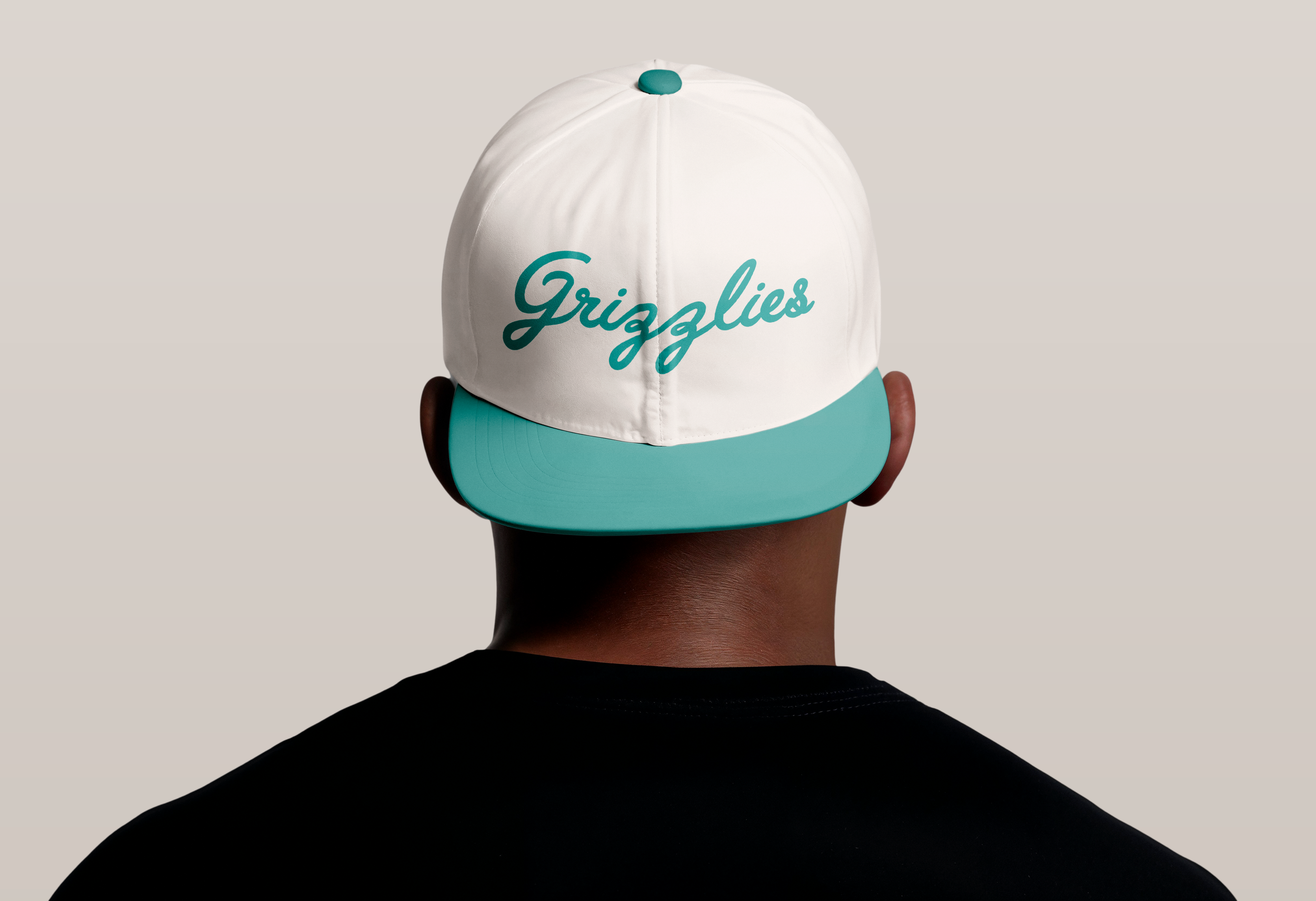
THE MEMPHIS GRIZZLIES REBRAND
Project role: Brand identity
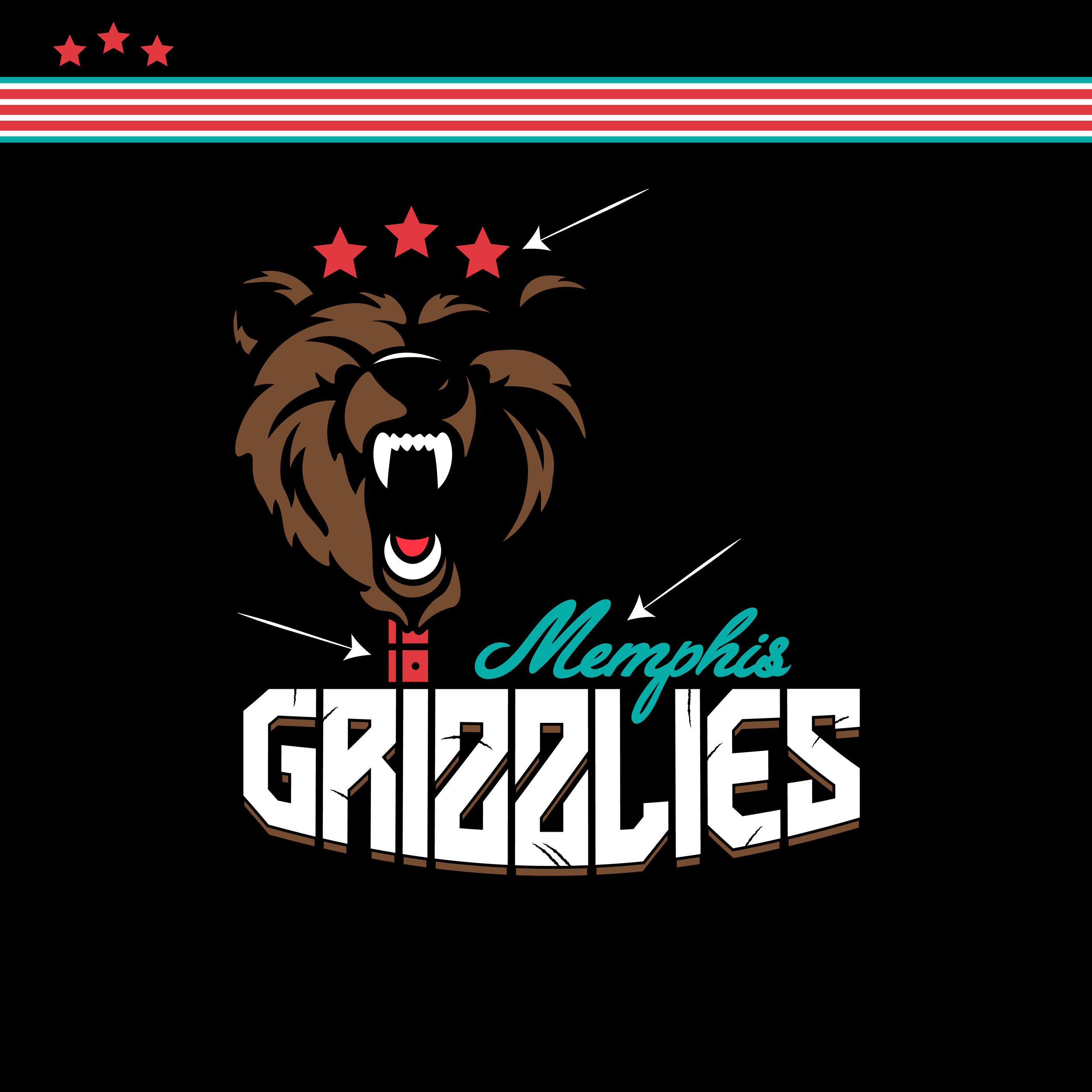
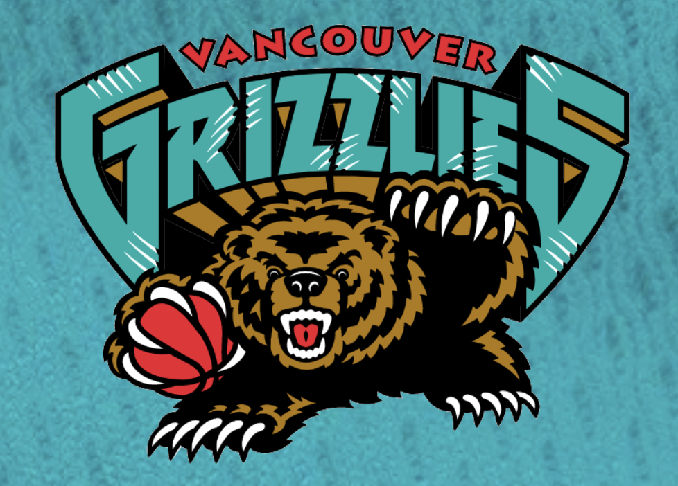
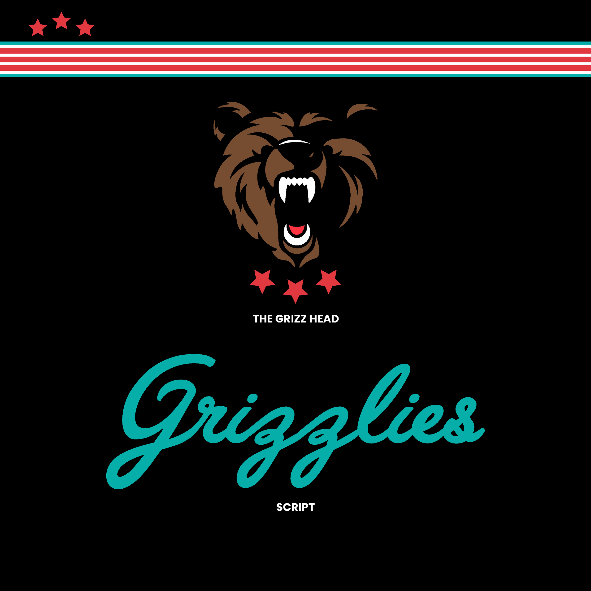
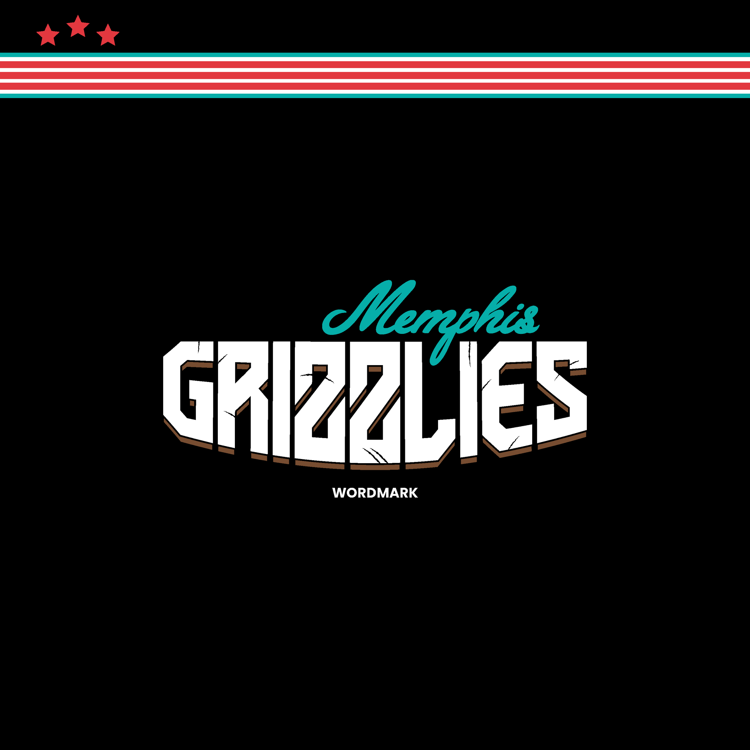
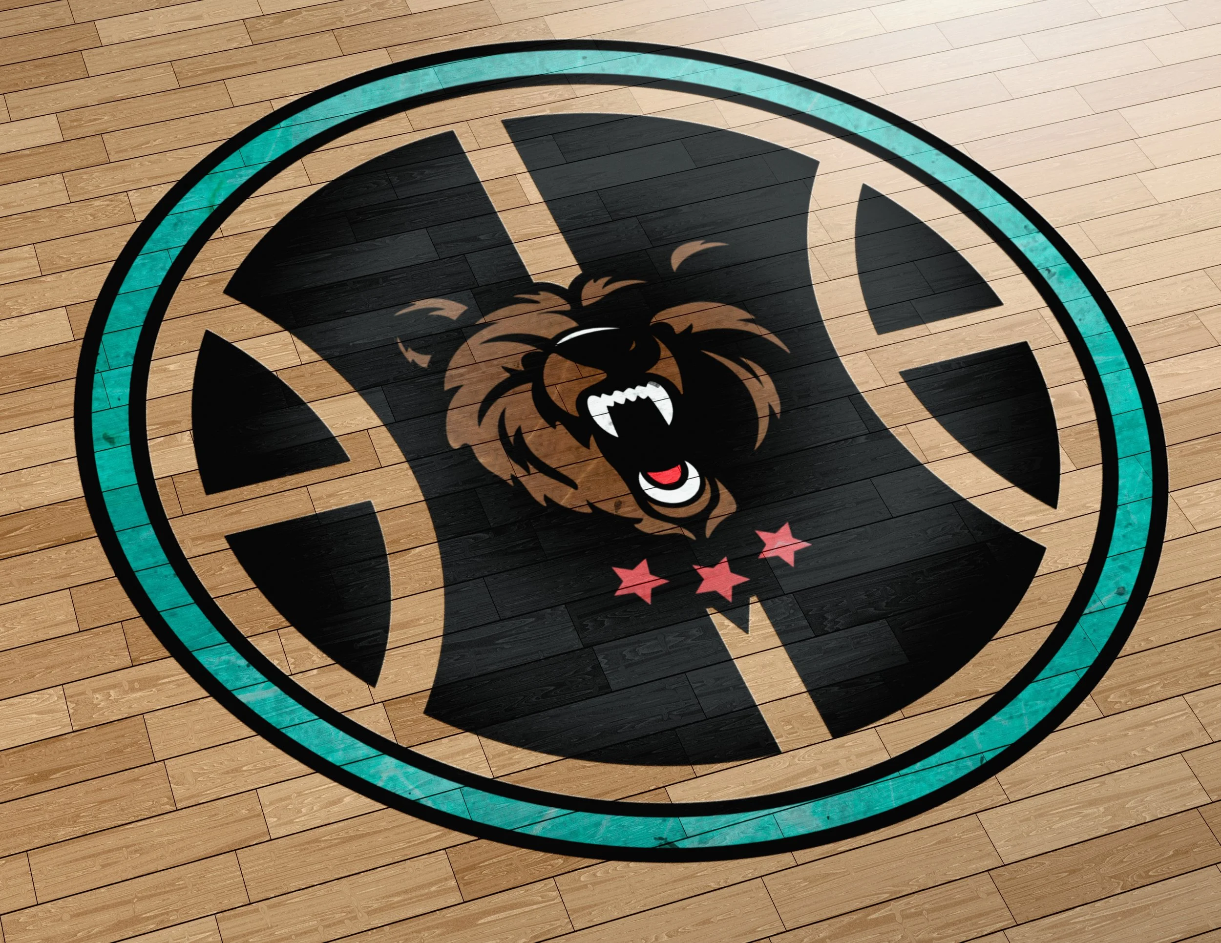
The Memphis Grizzlies, once the Vancouver Grizzlies, went away from their once vibrant color scheme and roaring grizzly bear head once moving to Memphis back in the early 2000s. The idea behind my rendition of a rebrand was to bring back elements from the Vancouver Grizzlies and implement them in a modernized style. The bear head being the prominent piece, I included a small part of a guitar neck for the main logo to represent the presence of jazz and blues in the city of Memphis. The 3 stars represent the tristar logo from the Tennessee state flag, and the teal color I’ve deemed “Lorraine” teal (an ever so slightly different shade of teal) connected to the famous Lorraine Motel in Memphis that Dr. Martin Luther King Jr. spent his last moments in. The “Grizzlies” claw font used is directly inspired by the original Vancouver font style.